
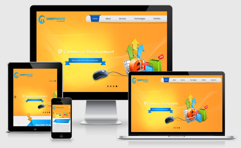
Web design is an extention of page design, and page design was all about crafting the perfect paragraph. To craft the perfect paragraph you need to be working with the content. Responsive design is about a single source of content across many viewports and, therefore, requires the content up front for a truly award winning design that spans a million devices. Responsive web design (RWD) is a web development approach that creates dynamic changes to the appearance of a website, depending on the screen size and orientation of the device being used to view it.
HTML is served to all devices, using CSS (which determines the layout of webpage) to change the appearance of the page. A three-column desktop design may reshuffle to two columns for a tablet and a single column for a smartphone.
RWD has potential advantages :-
- maintenance easier over time
- future-proof
Unity, balance, hierarchy, scale, & contrast are the principals of design that form the foundation of our philosophy. Responsive Design is an art in understanding expectations at a variety of screens sizes. We were early adopters of the technique, continue to push its bounds, and include it in every project we do.